Bullet Bound v2 - Day 2
Bullet Bound » Devlog
Day 2 - UI decisions
I've made 2 important decisions about the UI Revamp
- Keep the original theme of shapes - squares, triangles, circles etc'
- Use only a mouse to paint everything, i have a graphic tablet but i'm too lazy and too bad at art anyway
Changes i've made on day 2:
UI Changes
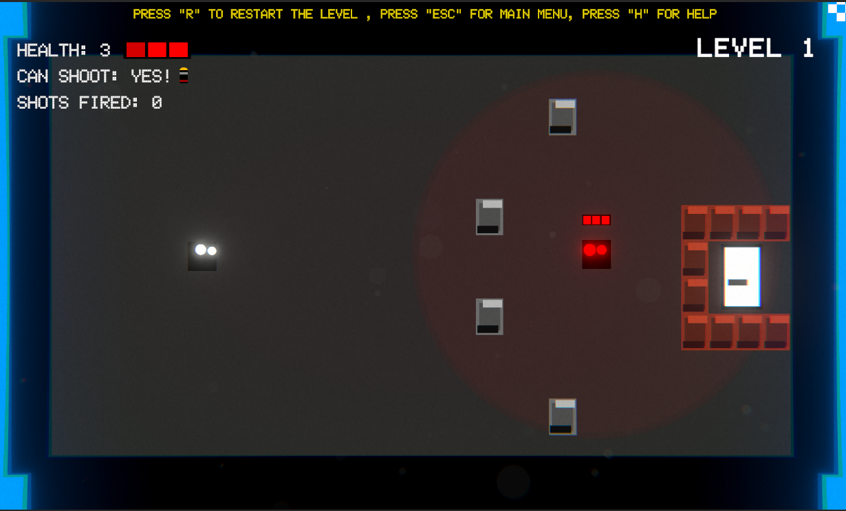
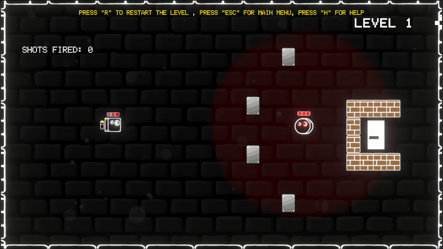
- Moves the Health bar and the Bullet images (for can fire or not) to the actual player, its not in the main canvas UI anymore
- Changed the UI of Walls and Unbreakable Walls
- Stationary enemy has been changed to a circle
OLD:

NEW:

Additional features
- Added a cool feature that the longer you press on the Bullet
Get Bullet Bound
Download NowName your own price
Bullet Bound
Top-down action-puzzle game created for a primitive shapes Jam with a theme of "One Bullet".
More posts
- Bullet Bound v2 - Day 5Nov 28, 2023
- Bullet Bound v2 - Day 4Nov 28, 2023
- Bullet Bound v2 - Day 3Nov 27, 2023
- Bullet Bound v2 in development!Nov 25, 2023

Leave a comment
Log in with itch.io to leave a comment.