Day 8 - Revamping the General Main Menu UI
Mutant Battle Grounds » Devlog


Day 8 - Revamping UI - "Less is more"
While i was playing with colors sizes trying to get a general look n feel theme for my entire game, i thought about how crazy things are getting and the fact that i'm not focused enough.
I started a new approach with "less is more" at the center, less colors, less crazyness, and sometimes when you do less you have more to show.
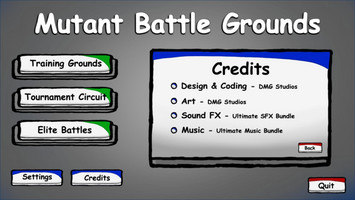
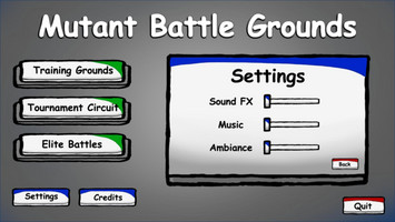
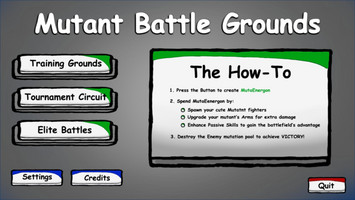
It turned out pretty good:
My main colors are:
- A variation of White
- Grey blends
- Black
- And other very basic colors - Green, Red, Blue, Yellow etc'
What i accomplished on Day 8:
- Hand painted everything in Photoshop
- Fully functional new Main Menu UI
- Different open and switching pages affect to Settings/Credits
- Change the information panel to a small "How-To" , instead of having a tutorial
Get Mutant Battle Grounds
Download NowName your own price
Mutant Battle Grounds
An Idle clicker game - Earn energon, spend on creating Mutants and upgrading their limbs!
| Status | In development |
| Author | Dekels |
| Tags | Idle, mutation, Unity |
More posts
- Day 9 - Before the last dayJun 26, 2023
- Day 7 - Mutants Revamp!Jun 26, 2023
- Day 6 - Main Menu UIJun 26, 2023
- Day 5 - Plans cut shortJun 21, 2023
- Day 4 - Mutation focusedJun 21, 2023
- Day 3 - What will 4 hours looks likeJun 20, 2023
- Day 2 - 2 hours of Focused workJun 20, 2023
- Day 1 - Started the jam 2 days late!Jun 20, 2023

Leave a comment
Log in with itch.io to leave a comment.